Interface
Principles
In an effort to try and show versatility and to be clear in our messaging, there are a couple guidelines that come into play when showing interfaces, UI components and patterns.
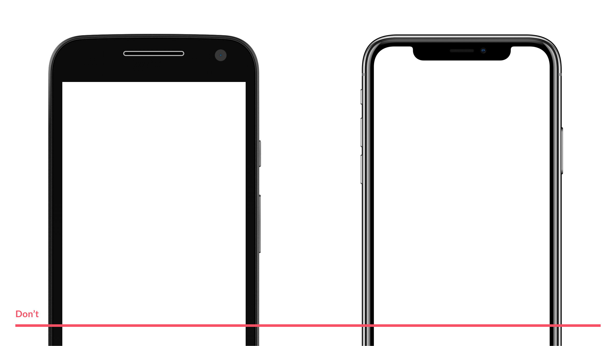
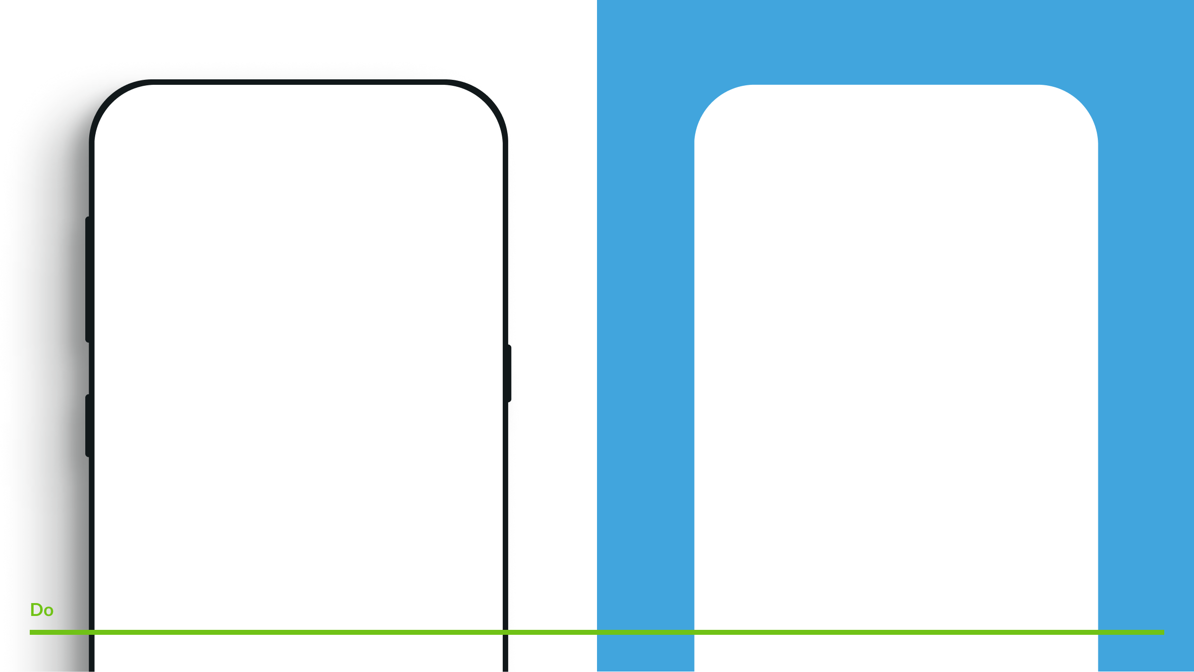
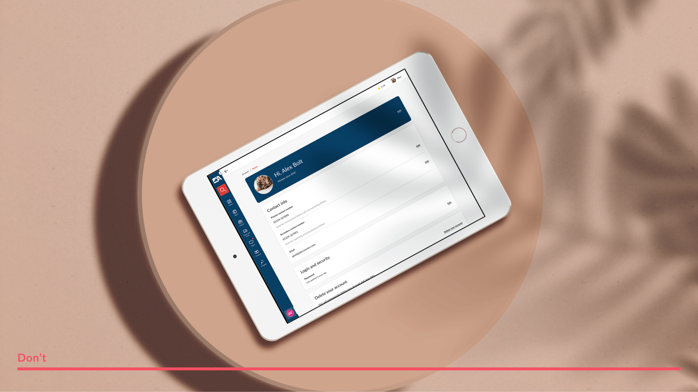
The clearest way to do this is to steer away from the typical device mockup. Having devices built rather with familiar shapes, shadows and forms that allude to a certain platforms or viewports, allows the focus to be on message and not the container.
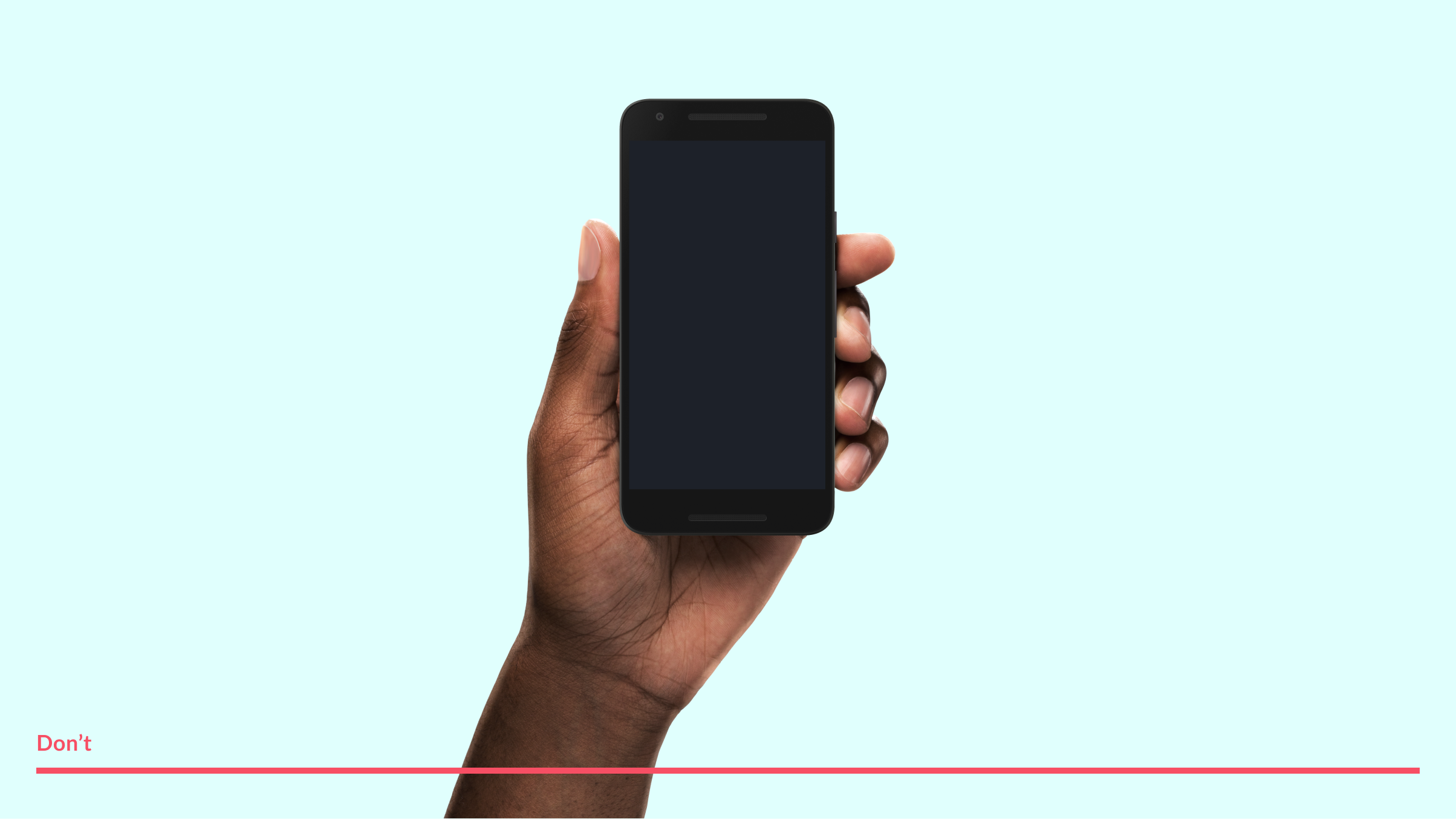
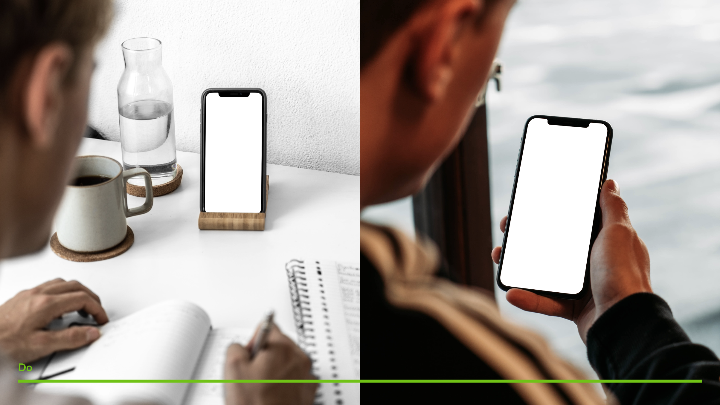
The exception this is would be when showing interfaces in situ. Avoid hands shown in a void, instead opt for natural settings and situations showing the interface at work in an environment as close to real as possible
Types
Showing an interface or our UI should be purpose driven — does this interface needs to educate, drive brand awareness or just tell a story?
There are 3 level of fidelity that our UI and interfaces should appear in - high, reduced and abstract
High
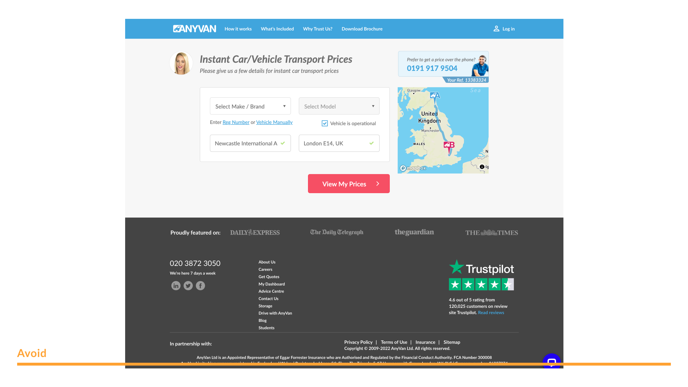
High fidelity interfaces offer an in-depth, highly detailed and accurate view of our interfaces and UI
Use these to show users how to navigate around, to use our products and platforms etc. High fidelity UI and interface representations should be used only if absolutely necessary
Reduced
Reduced UI and interface screens allows one to zoom in on specific features and details, while still providing enough context to help someone unfamiliar our platform or product
Use these to focus on a single element or feature. Always ask the question, "What is the least amount of elements and assets that I need to use to effectiely illustrate my point?"
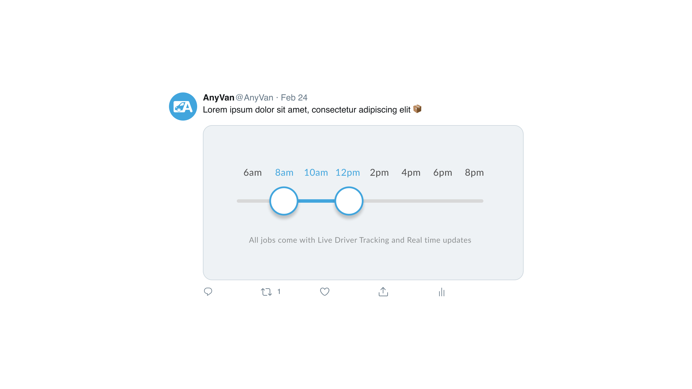
Get creative when showing reduced UI elements and interface assets

Abstract
Abstract interface and UI screens are meant to illustrate larger ideas or concepts by relying on very pared back visual representations
Use these to create brand recognition, especially in contexts with limited space or time to interact with users

Context
Always be mindful of where you are showing UI and interface elements. Avoid overly stylised and evidently rendered, unrealistic or unnatural settings or situations. As a rule, always show the interface in an environment as close to real and as realistic / feasible as possible

Misuse
Never show high fidelity UI and interfaces in ways that don't mimic or match reality
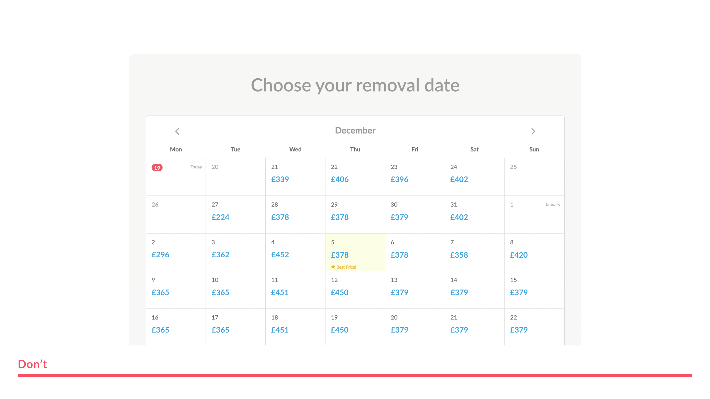
Avoid overly stylised and evidently fake scenes and settings when showing UI and interface representations

Cross-device
Remember when creating and demonstrating interface assets to show how flexible our interfaces truly are - this is done by avoiding the use of only desktop or mobile devices, and showing visuals on tablets or watches