Co-branding and partnerships
Brands
Confused as to what a brand is? Learn more about our brand architecture and ecosystem
Dominance
When partner logos are shown in close proximity to each other in a neutral environment, the dominant or primary brand will be placed on the left or top.
Always be conscious of which brand most influences the communication, experience and which brand is driving the audience's experience - adjust the branding and visuals accordingly, but always be critical in protecting the AnyVan brand.
Options
There are 2 lockup possibilities with co-branded logos, and the lockups you create depend on the shape of the partner’s logo and its brand standards.
Aligning partnership logos should follow clearspace rules as follows. The below also illustrates the adjusted relationship of the safe space to now include the partner logo when paired with the primary logo or logomark - partner logos should also always be vertically centered to the logo or logomark.
Stacked
Minimum size
Horizontal
Minimum size
Relationships
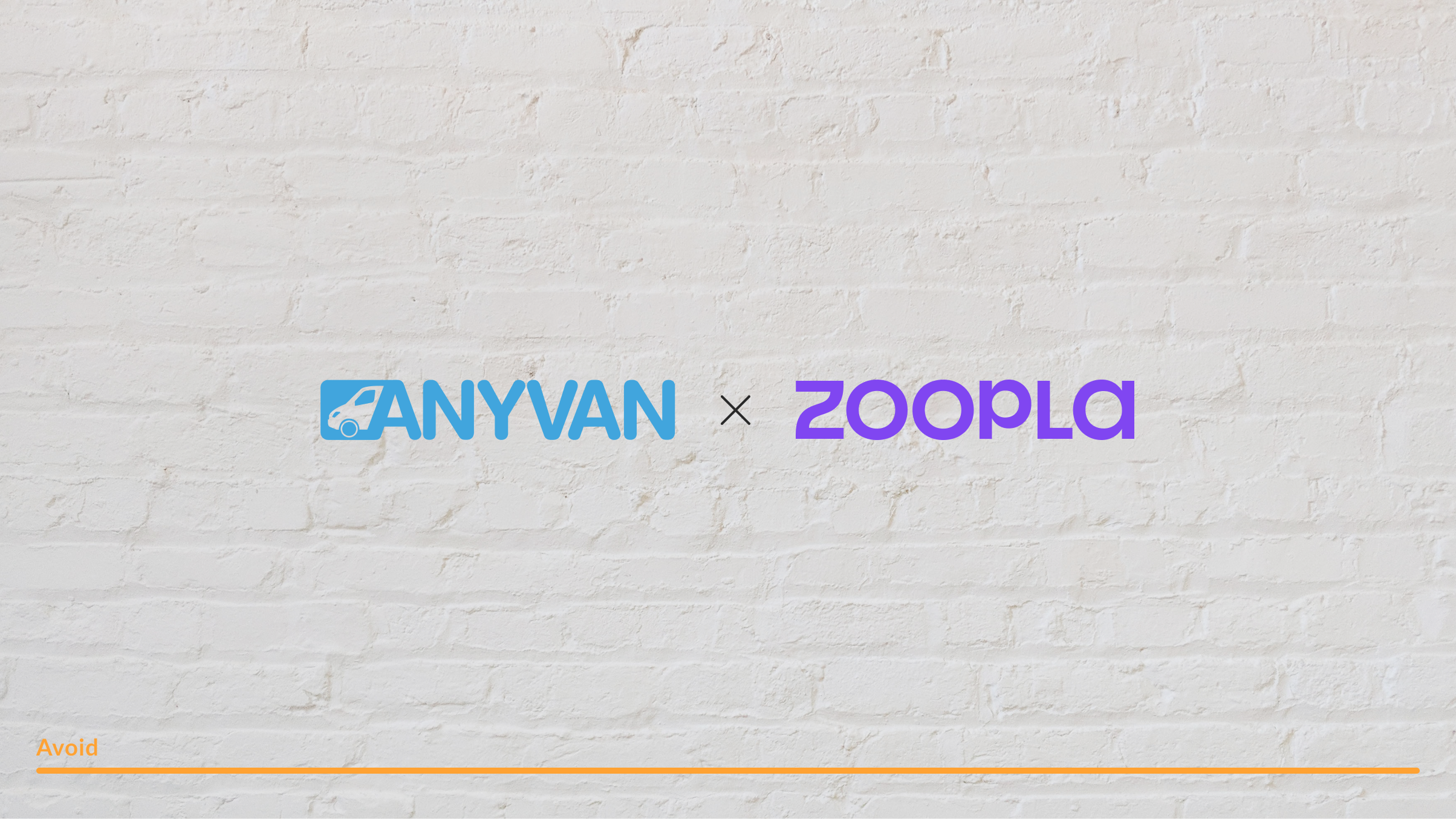
The pipe from the previous lockup can be changed to a stylized ‘x’ to show a closer working relationship between AnyVan and a partner. The height and width of the ‘x’ should be 45% of the height of the logo.
Never use a typeface to create this 'x' and always remember to use rounded end caps on the strokes of the 'x'
Visual weight
Even though, in the below diagram, the partner logo follows the aforementioned rules, the visual weight between the AnyVan logo and the partner logo is incorrect. As a general rule, always match the partner logo wordmark to the established height - marked as 'r' below - and ignore the other visual elements to get the best balance between the two logos.
Colour
Where possible avoid multi-colour lockup and pairings. Always try and reduce the logos down to a single colour to ensure the best visual representation and balance


MagicVan
An oft used motif, the heart is an instantly recognizable symbol of care, charity and compassion. Albeit, a strong mark for philanthropic efforts, the heart has become a design element that has been used so many times, it no longer feels original, unique or apt for today’s market or climate
Re-invention was needed here and by combining it with the route marker motif we can try and move the needle while still mainting an iconic symbol of charity