Illustrations

Style
Our illustration should never be cropped or timid. They should be used as a whole image and where possible should be as big and bold
Bold
Bright, high-contrast colors. Not in-your-face but definitely not timid, and should use the same tonality, vibrancy and feel of the primary shade of the audience or brand you are designing for

Dimensional
To make our illustrations feel more authentic, include shadows where elements overlap and highlights where one would expect them

Hand drawn elements
To bring in more personality, and where it makes sense, bring in hand-drawn elements - arrows, squiggles, circles - to highlight and to break the flat nature of our illustrations

Unexpected
Explore unexpected metaphors and moments. Illustrations shouldn't be silly or cartoonish, but should be seen as exuding a genuine sense of personality

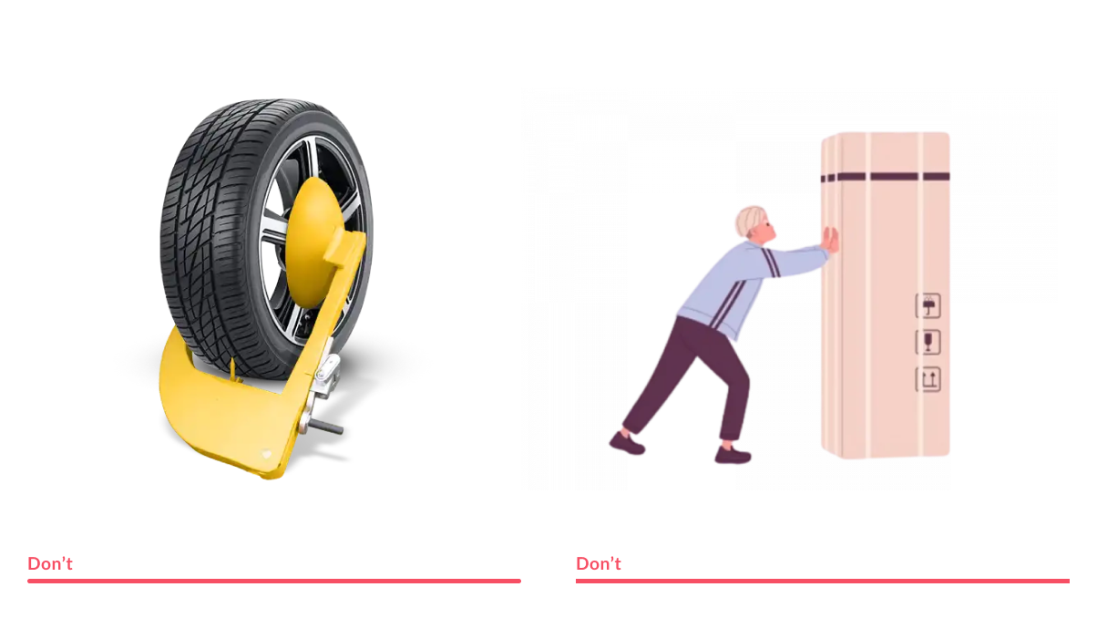
Misuse
Never use 3D renders in place of illustrations and always custom draw illustrations to ensure and maintain consistency and control