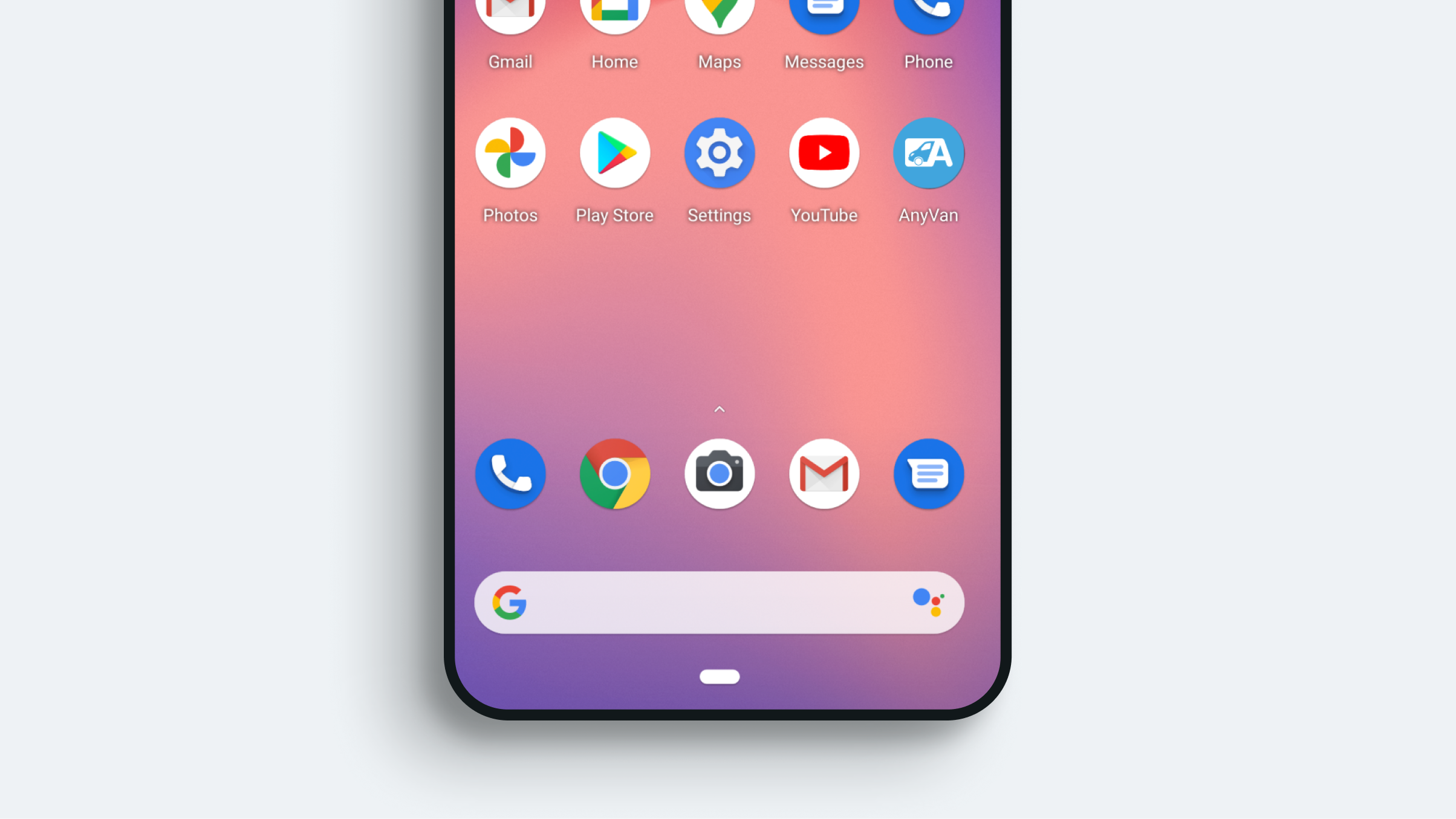
App icons
With app icons, the loss of details due the reduction in the number of pixels is inevitable, but general idea of the glyph should still be clear at any and every size - this is why our app icon should always be flat and should never include shading
Remember to always align the glyph, vertically and horizontally, inside of the icon shape and to be familiar with the safe spaces guidelines and grid allocations supplied by Apple and Google

Construction
The logomark height should be 40% of the height of the app icon container
Descriptors
The descriptor text height should be 9% of the height of the container. The kerning should be 2% and the font weight should be bold
Background colour for the descriptor shape should be #000000, set to 20% opacity to provide enough contrast
Advertorial usage
Taking stylistic cues from Google and Apple, pseudo app icons can be created and employed as app awareness devices and brand level pointers
Take note that the height of the logomark should be 40% of the height of the container and the corners should always be rounded — the curve is determined again by the height of the container, as shown below
Always maintain a clear space around the icon, which equates to 50% of the height of the overall container and that the minimum size of the icon is 60px
Other rules that govern descriptors, apply here as well
