Buttons

Buttons are used primarily for actions and the below rules aim to control these on applications that sit outside of our digital applications, namely across print, social media and emails
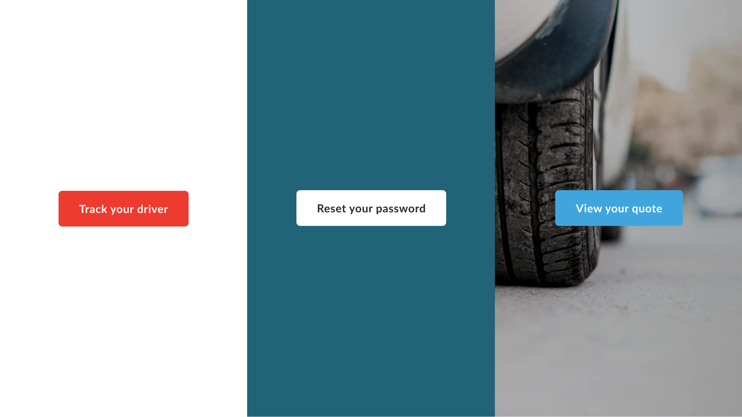
Construction
Primary buttons should be used in areas of high importance, usually as part of the main focus of an objective for an application or execution. They are the main call to action, and there shouldn’t ever be more than one primary call to action
Ensure that the button's height is 58px - this is to comply with mobile friendly usage and to match the 'large' button size from our digital ecosystem. There should be a consistent 30px clear space around the button and the copy should always be vertically centered in the container. Corners on either end should always be rounded and should use a radius of 6px
Don’t wrap button label text — for maximum legibility, a text label should remain on a single line. A button container’s width is dynamically set to fit its text label but should remain at least 200px. Only ever use the primary typeface, in 'Bold', a letterspacing of 0.3px and a font size of 18px / 1.125rem. Button labels should always use sentence case

Colour
Primary buttons should where possible appear in the primary colour - for AVC this would be 'Picton Blue' with white text. This can be reversed out in white if greater contrast is needed, or if Picton Blue - or any other primary colour - doesn’t sit well against the creative